Wednesday, 13 April 2016

Week 13

13.4.2016 (Week 13)
Zulkifli, Farah Farisya Syamin (300 357 070) 
Typography, The Booklet (cont'd)

Lecture: 
Mr. Vinod gave us individual feedback according to our latest mock-up and we were asked to amend what needed to be amended according to our feedback for our final work the week after. 

Instructions:
ype Arrangement, The Booklet (30%) 
Your task requires you to come up with 10-12 lines about your self. The lines can vary in the number of words (1 word, 5 words, 10 words). These lines will be arranged and expressed according to their meanings. Utilize the knowledge gained in all the tasks previously and express yourselves. To read more, click here.

                                                                                   My Process

I decided to make certain changes due to the feedback that was given by Mr. Vinod. 


I pretty much came up with this hoping it gives a sense of variety to it. 


The Outcome


 Feedback:
Mr. Vinod first advised on the folding which had a little trouble once it was all closed together where it wasn't all in the same length and folding and my work was a bit predictable where it lacked variety. 


Reflection:

  • Experience 
I needed to explore my creativity in doing this task and really implementing the things I've learned throughout the entire course. I must say it's tough for me not coming from an art background and I have honestly lost touched in my creativity but I had to give all that I could for this one. 

  • Findings
It's a personal work, it needs to be given much thought into in terms of placements, cohesiveness in design and it has to be interesting. 
  • Observation
I gotta say, art isn't my forte and I have so much respect for those who does this for a living. It's something people see as simple work but really, it isn't even close to simple. Also, art isn't taught, it's talent. It takes passion,patience, talent, interest and a whole lot of love to be in the art, design field. It's not something everyone has. 

Wednesday, 6 April 2016

Week 12

6.4.2016 (Week 12)
Zulkifli, Farah Farisya Syamin (300 359 070)
Typography, The Booklet 

Lecture: 
I missed another week of class this week due to another family emergency that could not be avoided. Was told that the class had another week of getting feedback from our booklet work and was instructed to work on drafting our next assignment. 

Instructions: 
Type Arrangement, The Booklet (30%) 
Your task requires you to come up with 10-12 lines about your self. The lines can vary in the number of words (1 word, 5 words, 10 words). These lines will be arranged and expressed according to their meanings. Utilize the knowledge gained in all the tasks previously and express yourselves. To read more, click here.

My Process

This week was a tough one, still digesting on my father's passing hence, all the family emergencies and missed classes. I wanted to express how exciting my pregnancy was but I couldn't continue working on it. I was searching for inspiration and I turned to my own feelings. Due to the freedom given on this task, I find it a personal one and so I decided to turn to my current emotions and feelings. 

Inspiration...


I used my grief on losing my father to express myself and so I started to work on it. 


 I started drafting how I wanted it to be. I wanted it to be personal, clean and cohesive. 


This was after several attempts, I had to print and reprint until I got it right. 

I kept the fonts which was paint brush but I chose only two types to use. I did not want it to look too much. 

The Outcome 


These was what I wrote on the booklet, fonts and its arrangement that were made. 

 This is how the accordion fold looks like from the inside. 
(Front and back) ->

This is how the front looks like on the hard cover. I printed my name that I've created on the illustrator on week 3 (Type Design) on a sticker paper and stuck it on the front as directed by Mr. Vinod. 


Feedback:


Reflection:

  • Experience 
It was tough doing this mainly because it was really personal and for what I have chosen to write. I really wanted it to look clean, cohesive and nothing too much. Though it took a lot of work, with assembling the booklet and getting to the printing shop with a half an hour queue to wait for my turn just to print the name on the sticker paper but I'm glad I managed to get it done and hopefully it's at least good enough. 

  • Findings
After reflecting back on my work and the progress of this task, I learned that less is sometimes more. 
  • Observation
Assembling this was a bit complicated due to wanting it to be perfect! It took few attempts to make it look pleasing. 

Week 11

30.3.2016 (Week 11)
Zulkifli, Farah Farisya Syamin (300 359 070)
Typography, The Booklet 

Lecture: 
I did attend class due to a family emergency but I was told that the class was instructed to work on the booklet with Mr. Vinod's guidance. 

Instructions: 
Type Arrangement, The Booklet (30%) 
Your task requires you to come up with 10-12 lines about your self. The lines can vary in the number of words (1 word, 5 words, 10 words). These lines will be arranged and expressed according to their meanings. Utilize the knowledge gained in all the tasks previously and express yourselves. To read more, click here.

My Process

Due to the feedback given by Mr. Vinod, I decided to make a few changes to my type arrangement. 


Feedback:
I just saw your work. It isn't adequately achieving the intended in a holistic manner. Please take a look at the blogs of the individuals I mentioned and look at their works

Reflection:

  • Experience
I must say, my first attempt got me excited but when I look back at them, I find it not so cohesive, it doesn't look so clean and it feels a bit clustered hence I have to change it all. 

  • Observation 
I'm getting a little anxious on what exactly this assignment will lead into and how the outcome would be. 

  • Finding
I really need to find inspiration and a get into a clearer mind. 

Wednesday, 23 March 2016

Week 10

22.3.2016 (Week 10)
Zulkifli, Farah Farisya Syamin (300 359 070)
Typography, The Booklet 

Lecture: 
Mr Vinod started the class by giving feedback on our past work generally, gave a few points followed by an introduction to this week's task. He then demonstrated how to craft the booklet then how to work on the Illustrator and gave tips and tricks. 


Instructions:

Task 2 (20%): The Booklet
Your task requires you to come up with 10-12 lines about your self. The lines can vary in the number of words (1 word, 5 words, 10 words). These lines will be arranged and expressed according to their meanings. Utilize the knowledge gained in all the tasks previously and express yourselves.

The booklet you are creating has 8 pages in all (2 A4 sheets stuck together and divided into halves). The format of the booklet is an accordion fold and affixed on either end with a card-board.


You have to compose your lines on the various pages, using a variety or appropriate fonts/typefaces, and then considering the size, impact of the respective artworks, place them in an appropriate sequence to ensure a healthy variation from page to page.

A demonstration of this shall be conducted in class. How to fold, how to create your illustrator template and how to place the typographic artworks (expressions of the different lines) in illustrator.

You will submit, a hardcopy print out and upload the respective JPEGs of the 8 pages in spreads of 2 onto your eportfolio.

Marking Criteria: Your work will be judged on whether you have been able to express the meaning of your sentences through your typography and layout (arrangement). The layouts must showcase sensitivity and creativity in the choice of font, its arrangement, its relevancy and its suitability in context of the sentences. It must reflect and enhance the inherent meaning of the sentences.

You must look at the arrangements for all the pages and decide whether the pages look like a cohesive unit, whether there is a level of consistency or variation, so as to avoid monotony or over-consistency.

You will be judged on whether you have demonstrated critical thinking and exploration, research capability, ability to chronologically document your process and reflect on your journey. This evidence must be visible in your postings in the eportfolio and your in-class process work.


Duration: 3 weeks
Deadline: week 13


My Process and Research
In class, we were taught how to craft our accordion fold booklet so this is how my mock up turned out to be

With the mock up, it's super easy to imagine the artwork and work around it especially on Illustrator. 
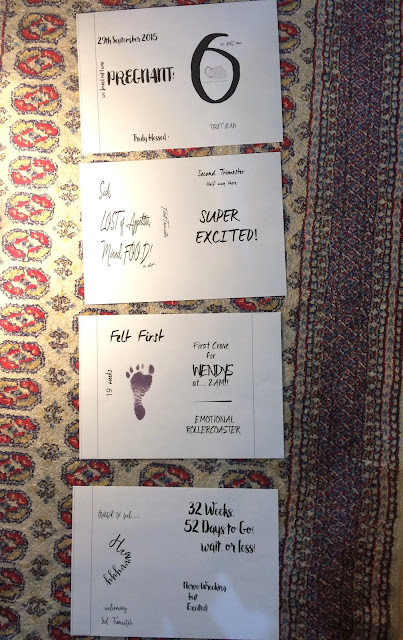
Then... I started thinking of a theme as I wanted my booklet to tell a story instead of going astray and so since I'm pregnant, I thought I would talk the opportunity to use that as my story. Being pregnant itself gives a lot of emotions as well as feelings, so why not express it! 
Theme (done!) 
As for font choosing, I chose to search for a current font trend and the first thing that popped into my mind was brush fonts! Since 2015, they've been a hit and most ads on Facebook, posters, cafes are using that type of font and so I started googling and downloading them. 
Example of brush fonts: 


After sucDisplaying FullSizeRender.jpgcessfully downloading them, I started to draft my artwork on paper. 


Choosing what to write was a bit tough because there's a lot to choose from but for now, I'll leave it as this. It took a lot of brainstorming and not to forget some calculations on the weeks! I plan to put some small illustrator to adapt the drawings I made but that would need approval from Mr Vinod so we'll have to see in next week's class to know his thoughts.


Here's my work on Illustrator! I had troubles with the margins as you can see. Gotta check back with Mr. Vinod in the next class. 

Feedback:
I see you have worked on the mock up on week 10 good. I hope you have also started working on the layout and designs. You must. You must find out and keep track of what i have said in class. Submission will be soon. So must return to focus on the task at hand were you to get through.
Reflection:
  • Experience
It got exciting once I got almost everything figured out from the theme to the font and the idea of the construction of the work. 

  • Observation 
After a few weeks of feeling a bit off on the creativity, I find myself being very into it this week. Maybe it was because I have an idea for it, something I'd like to craft and keep. 
Still having problems with the margins. Gotta check back with Mr Vinod!

  • Finding
I'm thankful I found the fonts for this one! 
Displaying FullSizeRender.jpg

Wednesday, 16 March 2016

Week 9

16.3.2016 (Week 9)
Zulkifli, Farah Farisya Syamin (300 359 070)
Typography, Type Arrangement, The Letter (Continuation) 

Lecture: 
Our class started with an explanation of the next task which was the booklet, continued with some feedback regarding our current task followed by a lecture on some technicality in typography. 

Instructions: 
Type arrangement (30%)
Task 1 (10%): The Letter
In this task, you will write (type) a single page love letter to your beloved who has been abroad for the last 6 months. The year is 1986, the world wide web or internet isn’t yet available to the masses, however the desktop computer has been invented. Letters are still a popular means to send and receive news. As, such it has been your practice to write one letter a week on your new desktop computer, print it, seal it in an envelop and post it to your beloved. This single page letter must be written sensibly and sensitively. To read more, click here.  

The Outcome of My 3 Options

Font used: Wendy Std 
Font used: Wiesbaden Swing Std
1. Font Used: 
Wendy Std  


2. Font Used: 
Weisbaden Swing Std


3. Font Used: 
Coronet Std 


Feedback:


Reflection:

  • Experience
As you can see there's no process in this post of mine as I knew exactly what I wanted. Thanks to Mr. Vinod's new post on Facebook which was a list of fonts, made it much easier to choose. I went for something fancy but nothing that was hard to read nor write. I had to make changes as last week's drafts, I found that the fonts I picked was a bit hard to read. 

  • Observation 
I made certain changes and adapted what I've learned in last week's class. I used margins to make for the alignment and changed up the paragraphs to make it look more interesting.

  • Finding
 I searched for famous love songs during the 80's and of course I had to go with Lionel Richie's Truly just to fit the theme!