Wednesday, 24 February 2016

Week 7


25.2.2016 (Week 7)
Zulkifli, Farah Farisya Syamin (300 359 070)
Typography, Ad Expression 2 

Lecture: 
We started our class with a lecture today on 'Fonts'. We gained a lot and realized that we, well I personally have made many errors due to lack of knowledge especially on this blog itself. There were a lot of terminology that we learned such as tracking, ragging, kerning. 
We also learned on the difference of 'hyphens' and its names (en dash, em dash) 

We then moved on to the illustrator where Mr Vinod explained how to apply what he explained on his presentation on illustrator. He created his own take on the ad and as he was working on it, we were free to ask any questions regarding the the Illustrator. 

Instructions: 
Task 2 (10%): Ad Expression
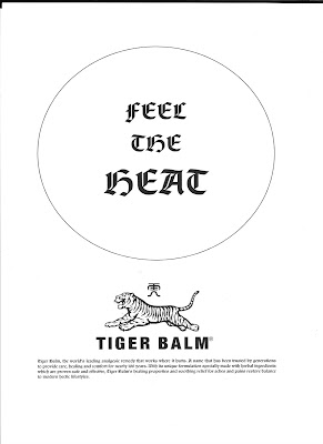
You are required in this task to express the headline for a black and white advertisement for Tiger Balm. The ad must express through the chosen font and arrangement, the inherent meaning of the words in context of the Ad. To read more, click here. 

My Process


First, I came out with this and I asked for my husband's opinion and he pointed out that when he first saw the headline, he saw 'feet' and so he suggested I change the word 'the' and so I did and I came out with this...

I made changes to the word 'the' and aligned the tiger balm logo with the 'E' of the word 'the'. Also, it sort of reads 'FEEL THE TIGER BALM HEAT' if you were to analyse it and that was the purpose when I was arranging the logo and the headline. I also changed the description of the product to justified instead of centered to make it look better. 

My Outcome 


Left: Artwork                                                                                                                      Right: Artwork on Microsoft Word


Rationale of artwork:

Inspired by an artwork I searched for on Google and also from our last class with Mr Vinod and his take on this artwork, this was what I was able to come up with. I chose two different fonts to differentiate what the word meant to the brand and what it represented. As you can see, the main word I wanted to highlight was the word 'Heat' hence why I chose a different font for it to create more emphasis on the word. I picked a font that had some elements that made it look Chinese as the creator of the Tiger Balm was a Chinese man also to represent a fire element or even describe the 'menthol' feel. I personally think that the serifs of the font for 'Heat' represented both of the elements. 

To put more emphasis on the word 'Heat', I made two lines (top and bottom) with the shape ends that suits that specific font I chose as well.  I positioned the tiger balm logo right after 'Feel the' because first of all, I needing something to fit the space next to it. Second of all, I felt like it portrayed that the tiger was screaming the words (Feel the) out, it helped bring the artwork to life and lastly, if you were to analyse it, it reads 'FEEL THE TIGER BALM HEAT'. The two tiger balm product image that was put next to the word 'Heat' was just to represent the meaning of the word and the feeling of the product 'menthol'. 

Inspirations:


I searched for 'feel the heat typography' in my google search engine and this was the first image on the list and also the one that caught my eye. I liked the fonts use, structure and how the flow appeared. 
Also, I used last week's findings such as the background of the brand itself and so on and so forth to help me decide on fonts and what I wanted it to represent as well. 


Feedback:


Reflections :

  • Experience 
After the last class with Mr. Vinod, I took some pointers and also learned new skills to interpret my artwork. I now knew how 'kerning' works which I used for my type work, I knew how to individually move my letters so it was fun to see how my artwork progressed. I also did practiced printing my artwork first and checking for any errors because we learned to be aware that it may look different on screen and after it is printed which is absolutely true! I did it twice and found a few things that needed to be changed. 

  • Findings
Every week I'm starting to realize how intense working on an artwork can be! I'm a Psychology major and I think graphic design requires if not the same, even much more thought on to it! 
  • Observation
Because of last week's class, I moved a little faster today working on my artwork and what I mean by faster was knowing what to do and how to use specific tools and did not stress that much. I was progressing in terms of knowing how to handle the Illustrator. Also, I'm more particular on the artwork instead of going "Oh well!". I checked through for some things for example alignment and etc. Though I know this isn't a masterpiece and I'm sure it has a lot of room for improvement I suppose but I'm quite happy with it. 

Week 6

24.2.2016 (Week 6)
Zulkifli, Farah Farisya Syamin (300 359 070)
Typography, Ad Expression 

Lecture:
Unfortunately I wasn't able to make it to class last week but I was told that the routine went on as per usual with everyone sharing their task and experience and had a discussion on the our following task which is Ad Expression. 

Instructions: 
Task 2 (10%): Ad Expression
You are required in this task to express the headline for a black and white advertisement for Tiger Balm. The ad must express through the chosen font and arrangement, the inherent meaning of the words in context of the Ad.
The copy for the Ad is as follows:
Headline: FEEL THE HEAT!
Copy: Tiger Balm, the world’s leading analgesic remedy that works where it hurts. A name that has been trusted by generations to provide care, healing and comfort for nearly 100 years. With its unique formulation specially made with herbal ingredients which are proven safe and effective, Tiger Balm’s healing properties and soothing relief for aches and pains restore balance to modern hectic lifestyles.
Logo & Product:
TigerBalm-logo-1
TigerBalmProduct
You may use minor graphical elements like lines or dots (if relevant or needed) to aid in the expression of the headline. This is not a visually driven Ad, so do not give undue attention to the product or logo, emphasis is on the headline and copy.
Black and white Press Ad.
Newspaper: TheSun
Size: 128mm (width) x 178mm (height)
Outline around Ad: 0.5 pt stroke width
Marking Criteria: Your work will be judged on whether you have been able to express the meaning or action of the headline through your designs. The designed headline in the type expression task must showcase sensitivity and creativity in the choice of font, its arrangement, its relevancy and its suitability in context of the Ad. It must reflect and enhance the inherent meaning of the headline. You will be judged on whether you have demonstrated critical thinking and exploration, research capability, ability to chronologically document your process and reflect on your journey. This evidence must be visible in your postings in the eportfolio and your in-class process work. 

My Process 
First of all, I searched for inspirations on the internet on Tiger Balm posters and ads just to get a rough idea and these were the ones that I picked out of the bunch of posters.... 


Secondly, I started doing some background research on the product on Wikipedia where I found that it was developed in the 1870s in Rangoon, Burma by herbalist Aw Chu Kin, son of a Hakka herbalist in China, Aw Leng Fan. This was to help me understand more of where the product was originated to help me choose the right typeface to go with the product in my ad. 

My Options 

1. The typeface that I used was 'San Marco'. I enlarged the word 'Heat' to just emphasize what Tiger Balm is, which was menthol. The typeface kinda made it look very old newspaper typeface ad to me which represents Tiger Balm which has been around for decades. 

2. This was just taken from concept as picture one above except that I changed its position into landscape. I kinda like how the logo of the tiger is facing towards the direction of the caption 'FEEL THE HEAT' in a bubble where it looks like it screams out the headline. 


3. Typeface chosen was 'Penumbra Sans STD Bold'. The typeface reminded me of headlines of old kung fu chinese movies which to me fit Tiger Balm. I wanted to emphasize the Headline and made the logo into a watermark. 


Feedback: 

General feedback 

  • Apply recent lessons in class into new class, it shows development. 
  • In process, it's best to include mind maps to explore ideas, experience the product to get the feel hence, experience is crucial. 
  • Utilize each lesson and apply it in process, crafting and outcome. 
  • Depending on what type of art work that it specifies for (in this case, it's a press ad) hold it and optically analyze to analyze the font point (readable/not to the target audience) 
  • Concentrate on the headline and the expression of the ad. 
  • Watermarks don't work on ads. 
Reflections: 
  • Experience 
I'm honestly giving up on my Adobe Illustrator as I've been having problems with the software where I couldn't translate my work into its software. I love working on it but the software keeps failing on me where I cant seem to sign in so I had to work all this on my Microsoft word. Thankfully, this week is just all about process so these rough ideas were just translated on my Word Office. Will have to seek help YET AGAIN on the installment of the software itself. As for the artwork, it's pretty decent but again, this is just the process which means I will have another week to work on getting the ad design better. 

  • Findings 
I find that it's important to have knowledge on the background of the product before doing the design so it's so much easier to translate and link to on the artwork. Since it was very Chinese, I had to find typefaces that suits the brand. Wouldn't want to make it all western, it has to represent. 

  • Observation 
I'm pretty calm this week though my software broke down on me (usually I would actually freak out and will be bugging all my friends) but again, thankfully it's all just process this week! 

Wednesday, 17 February 2016

Week 5

17.2.2016 (Week 5)
Zulkifli, Farah Farisya Syamin (300 359 070)
Typography,Type Expression: Task 2

Lecture: 
Last week we were on our CNY break hence there was no class but we were instructed to work on our process for our type expression task. 

Instructions: 

Type expression (20%)
Task 1 (10%): Single Word Expression
Identify 4 words that describe you. You will then express typographically the meaning of these words without the aid of a visual. You are only allowed to manipulate the type to express the inherent meaning of the chosen words.
Draw two 7cm squares on an A4 graph paper using a pencil. Ensure the boxes are centered vertically and horizontally in the A4 paper. Do the same for two other sheets of paper to obtain 4 squares in total.
Draw and express you respective words. Upon approval digitize your artworks using Adobe Illustrator and print them out. Update your eportfolio throughout the task and ensure every aspect of the process is documented methodically. 
Marking criteria: Your work will be judged on whether you have been able to capture the meaning or action of the chosen words through your designs. The designed words in the type expression task must showcase sensitivity in balance, proportion and composition. It must reflect the inherent meanings of the words. You will be judged on whether you have demonstrated critical thinking and exploration. This evidence must be visible in your postings in the eportfolio and your in-class process work. 

My Process 

Honestly it was all done according to the previous process that I have made last week. I just made a few amendments in terms of structure to suit the words chosen. 

First of was 'Optimistic' and The typeface that I used was American Typewriter which I thought in my personal opinion suits the word and brings the character to it. It was structured this way because I wanted to add more life into it. As for the structure, it was actually inspired by this... 


I liked how the word 'Achievement' was structured hence why I took this as an inspiration though yes, it did not come out looking exactly the same. 


The typeface that I used for my word ‘Passionate’ was Snell Roundhand. Passion is a very emotional word or an intense emotion and in my personal view, when it comes to feelings or emotions it has to represent softness hence why I picked a Script font to represent the word.


I chose the typeface ‘Didot’ to bring my word ‘Realist’ into its character. The reason why there’s a period that was placed after the ‘t’ was to represent how I felt the word described me. I find myself being pretty realistic in all the decisions I make and that’s that and I don’t consider myself as a dreamer when it comes to making real life decisions hence, the period to represent that statement.

 Again I chose the typeface Snell Roundhand to represent my word ‘Softie’ as it describes a feeling hence why the structure has to have that flow to it too.


Adapted on Microsoft Word 


Feedback: 

Considering your situation your attempt at task 1 was decent. Your ideas for the words were acceptable but we're lacking potency or further exploration. This is probably due to the distraction you have been experiencing and the lack of time and focus. 
I believe you are more capable than the present outcome unfortunately circumstances aren't favourable to you at the moment
Reflection: 

  • Experience 
I'm getting used to the Adobe Illustrator and starting to enjoy learning it bit by bit and honestly it's getting a little addictive and so it was not too much working on this task. Probably with more experience on Adobe, my artwork would probably be much better than this but I'm certain it'll get there with more practice and exercises. As for for the structures on words that I designed, I wish it could be much more artistic but I think I'll just have to deal with this first. 

  • Observation
I suppose after the first experience with Adobe Illustrator, I worked on this much faster. The progress on the Adobe did not take too long as before and also not to forget, it wasn't as frustrating as the last task that I had to work on Adobe for the first time. 

  • Findings 
It's our 5th week now and honestly, this class is starting to grow on me. Takes me away from all the reading and research, and for a change, it's pretty nice to discover the artistic side of me (if I actually have any) 


Saturday, 13 February 2016

Week 4

13.2.2016 (Week 4)
Zulkifli, Farah Farisya Syamin (300 359 070)
Typography, Type Expression:Task 2 

Lecture: 
As usual as each and every week, we started with our sharing session on our last week's task where we shared feed backs and thoughts on each other's work,
We learned a lot about the structures, fonts, styles each of their names such such serif, sans serif and display. We also learned about the difference between typefaces and fonts. Typeface refers to a font type for example 'Georgia' and fonts on the other hand are more detailed for example 'Georgia Italic' or 'Georgia Bold'.

Instructions: 
Type expression (20%)
Task 1: Identify 4 words that describe you. You will then express typographically the meaning of these words without the aid of a visual. You are only allowed to manipulate the type to express the inherent meaning of the chosen words.

Draw two 7cm squares on an A4 graph paper using a pencil. Ensure the boxes are centered vertically and horizontally in the A4 paper. Do the same for two other sheets of paper to obtain 4 squares in total.

Draw and express you respective words. Upon approval digitize your artworks using Adobe Illustrator and print them out. Update your eportfolio throughout the task and ensure every aspect of the process is documented methodically.

Marking criteria: Your work will be judged on whether you have been able to capture the meaning or action of the chosen words through your designs. The designed words in the type expression task must showcase sensitivity in balance, proportion and composition. It must reflect the inherent meanings of the words. You will be judged on whether you have demonstrated critical thinking and exploration. This evidence must be visible in your postings in the eportfolio and your in-class process work.


My Process


At first these were the 4 words that I chose but then I do some changes on it. I dint seem to find the right font to show character on the word 'Sarcastic' and I thought that the font looked a bit tacky. 


I decided to go for these 4 words and I was pleased with the fonts that displayed the words. I chose: 1.Optimistic(American Typewriter) 
2.Passionate (Snell Roundhand) 
3.Realist (Didot) 
4.Softie (Snell Roundhand Italic) 


As for inspirations....


these were all of course courtesy of Google! 


And these are the fonts which I typed out on my Microsoft Word with each font that I chose. I plan to give it more character when it's adapted on Ai but roughly this is what it is for now. 

Feedback: 


Reflection: 

  • Experience
It was a bit challenging to find the right typeface for each word to represent its character and meaning and I was spoiled for choices with the variety of typefaces that we were given. 

  • Observations
Every week is getting harder especially not being too exposed in the designing field but it's exciting to finally get the chance to be creative in art expression especially this task where we had to choose 4 words that represents us. I gotta say, creating this on paper is far better than getting it on Adobe Illustrator and me being a newbie with the software which embarrassingly I just got it installed today, I'm really worried on how do I get these designs on Ai. 


  • Findings
I'm glad that Mr Vinod gave us his selection of typefaces to choose from. Imagining if we had the freedom to choose from his many many selection of typefaces, I would probably be even more tangled! 

Week 3

3.2.2016 (Week 3) 
Zulkifli, Farah Farisya Syamin (300 359 070)
Typography, Working on the Adobe Illustrator 
Lecture: 
Mr Vinod assisted us on converting our pieces into Adoble Illustrator.  
Instructions:
Task 2 (15%): Type Design
You are to design a number of alphabets and punctuations, as determined by the teacher. You will begin by sketching and exploring a minimum of 3 options.
The sketches of the alphabets are to be submitted on A4 graph paper for selection. As always, you will understand, analyse and reflect on the knowledge acquired during the allotted weeks for the task in your ePortfolio.
Starting with the letter “o” design a string of alphabets of similar characteristics. The subsequent letters must spell your name and therefore the characteristics of the letters must represent your personality.

My Process 


One of my many many attempts. I know understood what my friends were expressing regarding their experience with Ai. It was so hard to get it right and to mimic what I actually designed on paper. 

My Outcome


I ended up going for this one. Yes, it's not how I pictured it to be but it was the closest and at least more presentable than other attempts before. I think it looks playful though yes, it looks superbly immature but for a first timer, I just made peace with this one.

I really wanted it to turn out how I crafted it on paper like the above but, oh well! 

Scanner gone crazy so I had to capture this on my camera. 

Reflection: 

  • Experience
Adobe Illustrator was not only challenging my laptop (with countless attempts on self installation that failed that made me had to go to a computer store to get it installed perfectly) but it challenged me as well. It was so hard to work on the Adobe Illustrator, it took a lot of experimenting and a few tutorials to get me somewhere. It was frustrating that I couldn't design it the way I actually intended to but I did the best that I could. 

  • Observations
Adobe Illustrator takes a lot of practice! 

  • Findings
This task gave me a new found respect for designers. I now understand that it's not an easy job and it takes a lot to come out with a design not only that, there's a lot of time invested as well and not to mention some frustrations of getting it right in the process.