Wednesday, 23 March 2016

Week 10

22.3.2016 (Week 10)
Zulkifli, Farah Farisya Syamin (300 359 070)
Typography, The Booklet 

Lecture: 
Mr Vinod started the class by giving feedback on our past work generally, gave a few points followed by an introduction to this week's task. He then demonstrated how to craft the booklet then how to work on the Illustrator and gave tips and tricks. 


Instructions:

Task 2 (20%): The Booklet
Your task requires you to come up with 10-12 lines about your self. The lines can vary in the number of words (1 word, 5 words, 10 words). These lines will be arranged and expressed according to their meanings. Utilize the knowledge gained in all the tasks previously and express yourselves.

The booklet you are creating has 8 pages in all (2 A4 sheets stuck together and divided into halves). The format of the booklet is an accordion fold and affixed on either end with a card-board.


You have to compose your lines on the various pages, using a variety or appropriate fonts/typefaces, and then considering the size, impact of the respective artworks, place them in an appropriate sequence to ensure a healthy variation from page to page.

A demonstration of this shall be conducted in class. How to fold, how to create your illustrator template and how to place the typographic artworks (expressions of the different lines) in illustrator.

You will submit, a hardcopy print out and upload the respective JPEGs of the 8 pages in spreads of 2 onto your eportfolio.

Marking Criteria: Your work will be judged on whether you have been able to express the meaning of your sentences through your typography and layout (arrangement). The layouts must showcase sensitivity and creativity in the choice of font, its arrangement, its relevancy and its suitability in context of the sentences. It must reflect and enhance the inherent meaning of the sentences.

You must look at the arrangements for all the pages and decide whether the pages look like a cohesive unit, whether there is a level of consistency or variation, so as to avoid monotony or over-consistency.

You will be judged on whether you have demonstrated critical thinking and exploration, research capability, ability to chronologically document your process and reflect on your journey. This evidence must be visible in your postings in the eportfolio and your in-class process work.


Duration: 3 weeks
Deadline: week 13


My Process and Research
In class, we were taught how to craft our accordion fold booklet so this is how my mock up turned out to be

With the mock up, it's super easy to imagine the artwork and work around it especially on Illustrator. 
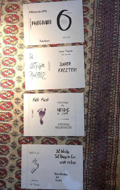
Then... I started thinking of a theme as I wanted my booklet to tell a story instead of going astray and so since I'm pregnant, I thought I would talk the opportunity to use that as my story. Being pregnant itself gives a lot of emotions as well as feelings, so why not express it! 
Theme (done!) 
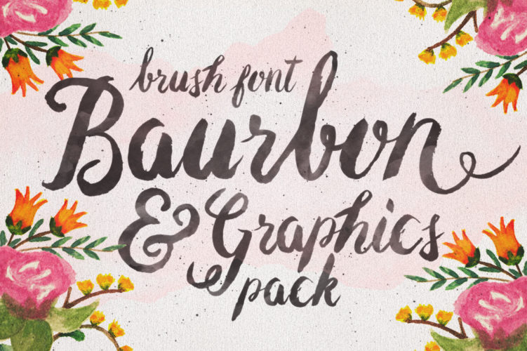
As for font choosing, I chose to search for a current font trend and the first thing that popped into my mind was brush fonts! Since 2015, they've been a hit and most ads on Facebook, posters, cafes are using that type of font and so I started googling and downloading them. 
Example of brush fonts: 


After sucDisplaying FullSizeRender.jpgcessfully downloading them, I started to draft my artwork on paper. 


Choosing what to write was a bit tough because there's a lot to choose from but for now, I'll leave it as this. It took a lot of brainstorming and not to forget some calculations on the weeks! I plan to put some small illustrator to adapt the drawings I made but that would need approval from Mr Vinod so we'll have to see in next week's class to know his thoughts.


Here's my work on Illustrator! I had troubles with the margins as you can see. Gotta check back with Mr. Vinod in the next class. 

Feedback:
I see you have worked on the mock up on week 10 good. I hope you have also started working on the layout and designs. You must. You must find out and keep track of what i have said in class. Submission will be soon. So must return to focus on the task at hand were you to get through.
Reflection:
  • Experience
It got exciting once I got almost everything figured out from the theme to the font and the idea of the construction of the work. 

  • Observation 
After a few weeks of feeling a bit off on the creativity, I find myself being very into it this week. Maybe it was because I have an idea for it, something I'd like to craft and keep. 
Still having problems with the margins. Gotta check back with Mr Vinod!

  • Finding
I'm thankful I found the fonts for this one! 
Displaying FullSizeRender.jpg

Wednesday, 16 March 2016

Week 9

16.3.2016 (Week 9)
Zulkifli, Farah Farisya Syamin (300 359 070)
Typography, Type Arrangement, The Letter (Continuation) 

Lecture: 
Our class started with an explanation of the next task which was the booklet, continued with some feedback regarding our current task followed by a lecture on some technicality in typography. 

Instructions: 
Type arrangement (30%)
Task 1 (10%): The Letter
In this task, you will write (type) a single page love letter to your beloved who has been abroad for the last 6 months. The year is 1986, the world wide web or internet isn’t yet available to the masses, however the desktop computer has been invented. Letters are still a popular means to send and receive news. As, such it has been your practice to write one letter a week on your new desktop computer, print it, seal it in an envelop and post it to your beloved. This single page letter must be written sensibly and sensitively. To read more, click here.  

The Outcome of My 3 Options

Font used: Wendy Std 
Font used: Wiesbaden Swing Std
1. Font Used: 
Wendy Std  


2. Font Used: 
Weisbaden Swing Std


3. Font Used: 
Coronet Std 


Feedback:


Reflection:

  • Experience
As you can see there's no process in this post of mine as I knew exactly what I wanted. Thanks to Mr. Vinod's new post on Facebook which was a list of fonts, made it much easier to choose. I went for something fancy but nothing that was hard to read nor write. I had to make changes as last week's drafts, I found that the fonts I picked was a bit hard to read. 

  • Observation 
I made certain changes and adapted what I've learned in last week's class. I used margins to make for the alignment and changed up the paragraphs to make it look more interesting.

  • Finding
 I searched for famous love songs during the 80's and of course I had to go with Lionel Richie's Truly just to fit the theme! 


Wednesday, 9 March 2016

Week 8

9.3.2016 (Week 8)
Zulkifli, Farah Farisya Syamin (300 359 070)
Typography, Type Arrangement, The Letter 

Lecture: 
I was not able to make it to our replacement class due to family emergency matters but was told that my classmates had a sharing session on previous work as per usual and the task for next week was explained. 

Instructions: 


Type arrangement (30%)
Task 1 (10%): The Letter
In this task, you will write (type) a single page love letter to your beloved who has been abroad for the last 6 months. The year is 1986, the world wide web or internet isn’t yet available to the masses, however the desktop computer has been invented. Letters are still a popular means to send and receive news. As, such it has been your practice to write one letter a week on your new desktop computer, print it, seal it in an envelop and post it to your beloved. This single page letter must be written sensibly and sensitively.

Your task is to use Adobe Illustrator to format this letter in a classical letter writing format (in the days of old) – when letter writing was done by hand – using a suitable font (or a combination of fonts), and appropriate margins, alignment, point size, leading and line length.

You will be required to print two copies; one without creases or folds, the other for postage. The letter for posting will require an envelop, as such thought must be put into the writing of the address on the envelop. You will post this letter to yourself, and you will bring this letter to class for submission and discussion. You will as always document all the processes, drafts and the final results on your eportfolio.


Important reading references:
Purdue: Common Letter Writing Formats
Good Letter Writing: Personal Letter Writing TemplateGood Letter Writing: Layouts

(Note* If you stumble on some additional references, do share the on our Facebook group).

Marking Criteria: Lorem Ipsum…

Duration: 2 weeks
Deadline: week 10

My Process&Research


The first thing that popped into my mind when I thought of classical love letters was the type of handwriting that they had - most of them were written in cursive which I absolutely love. To me, cursive writing looks very romantic and I've always adored how it looks. 

I thought of the movie 'The Notebook', I remember watching a scene where Allie discovered the letters that Noah sent and I remembered clearly how it was written and so I searched on Google! 


I also looked up how old love letters were and the pattern of how they would look. 


So, of course looking at the pattern of these letters, they were all written in cursive and so I started searching for Script fonts and had various options to choose from. 

And then I thought of the content. Their love letters would be intimate, very romantic, sometimes very poetic and not to forget very deep and meaningful. Basically the things we now call 'corny'. 

My Three Options


Font: Voluta Script Pro 

Font: Kuenstler Script LT Std 

Font: Shelley Script 


I had to choose fonts that had similarities to cursive hand writings which meant, it couldn't be 'too' complicated and so I chose my 3 picks.

General Feedback:

  • Clarity of pictures posted on blog affects marks 
  • Know the purpose of the task -Arrangement (technicality), Formatting and etc 


Reflection:


  • Experience
I had a problem with setting up the margins. Gotta check back on how to work with the margins in the next class. As for content, I honestly just wrote whatever came to mind and pretended I was in the 80's and a hopeless romantic who is writing for someone who misses a person.

  • Observation 
It was easy for me to envision how it would actually look like even before working on the process for this task but as for the technical stuff, I gotta check back in class. 

  • Finding
Through some romantic movies of the 80's, I gotta say I adore how romantic they are in terms of their gestures and choice of words. Cursive hand writing is really romantic, classy and it just displays the whole package! 

Wednesday, 24 February 2016

Week 7


25.2.2016 (Week 7)
Zulkifli, Farah Farisya Syamin (300 359 070)
Typography, Ad Expression 2 

Lecture: 
We started our class with a lecture today on 'Fonts'. We gained a lot and realized that we, well I personally have made many errors due to lack of knowledge especially on this blog itself. There were a lot of terminology that we learned such as tracking, ragging, kerning. 
We also learned on the difference of 'hyphens' and its names (en dash, em dash) 

We then moved on to the illustrator where Mr Vinod explained how to apply what he explained on his presentation on illustrator. He created his own take on the ad and as he was working on it, we were free to ask any questions regarding the the Illustrator. 

Instructions: 
Task 2 (10%): Ad Expression
You are required in this task to express the headline for a black and white advertisement for Tiger Balm. The ad must express through the chosen font and arrangement, the inherent meaning of the words in context of the Ad. To read more, click here. 

My Process


First, I came out with this and I asked for my husband's opinion and he pointed out that when he first saw the headline, he saw 'feet' and so he suggested I change the word 'the' and so I did and I came out with this...

I made changes to the word 'the' and aligned the tiger balm logo with the 'E' of the word 'the'. Also, it sort of reads 'FEEL THE TIGER BALM HEAT' if you were to analyse it and that was the purpose when I was arranging the logo and the headline. I also changed the description of the product to justified instead of centered to make it look better. 

My Outcome 


Left: Artwork                                                                                                                      Right: Artwork on Microsoft Word


Rationale of artwork:

Inspired by an artwork I searched for on Google and also from our last class with Mr Vinod and his take on this artwork, this was what I was able to come up with. I chose two different fonts to differentiate what the word meant to the brand and what it represented. As you can see, the main word I wanted to highlight was the word 'Heat' hence why I chose a different font for it to create more emphasis on the word. I picked a font that had some elements that made it look Chinese as the creator of the Tiger Balm was a Chinese man also to represent a fire element or even describe the 'menthol' feel. I personally think that the serifs of the font for 'Heat' represented both of the elements. 

To put more emphasis on the word 'Heat', I made two lines (top and bottom) with the shape ends that suits that specific font I chose as well.  I positioned the tiger balm logo right after 'Feel the' because first of all, I needing something to fit the space next to it. Second of all, I felt like it portrayed that the tiger was screaming the words (Feel the) out, it helped bring the artwork to life and lastly, if you were to analyse it, it reads 'FEEL THE TIGER BALM HEAT'. The two tiger balm product image that was put next to the word 'Heat' was just to represent the meaning of the word and the feeling of the product 'menthol'. 

Inspirations:


I searched for 'feel the heat typography' in my google search engine and this was the first image on the list and also the one that caught my eye. I liked the fonts use, structure and how the flow appeared. 
Also, I used last week's findings such as the background of the brand itself and so on and so forth to help me decide on fonts and what I wanted it to represent as well. 


Feedback:


Reflections :

  • Experience 
After the last class with Mr. Vinod, I took some pointers and also learned new skills to interpret my artwork. I now knew how 'kerning' works which I used for my type work, I knew how to individually move my letters so it was fun to see how my artwork progressed. I also did practiced printing my artwork first and checking for any errors because we learned to be aware that it may look different on screen and after it is printed which is absolutely true! I did it twice and found a few things that needed to be changed. 

  • Findings
Every week I'm starting to realize how intense working on an artwork can be! I'm a Psychology major and I think graphic design requires if not the same, even much more thought on to it! 
  • Observation
Because of last week's class, I moved a little faster today working on my artwork and what I mean by faster was knowing what to do and how to use specific tools and did not stress that much. I was progressing in terms of knowing how to handle the Illustrator. Also, I'm more particular on the artwork instead of going "Oh well!". I checked through for some things for example alignment and etc. Though I know this isn't a masterpiece and I'm sure it has a lot of room for improvement I suppose but I'm quite happy with it.